

今回は、Material UIのGridとCardを使ってレイアウトを調整していきます!
Material UIには、レスポンシブレイアウトグリッドを実装するためのコンポーネントであるGridがあるのでこれをアプリに導入する方法を知ってもらえると良いかなと思います。
まだ、React TypeScriptの開発環境を未構築の方は、「ReactとTypeScriptとRedux Toolkitの開発環境構築をしよう!」を参考にしてみてください!

本記事はReact・TypeScript・Redux Toolkitの利用を前提に実装をしていきます。
構築からデプロイまでやっていきますので、必要に応じて他の記事も参考にしてみてください。
学習に使った本はこちら!
 クマじい
クマじいAmazon Kindle Unlimited でもReactの本はいっぱいあるぞ!
Gridを使う前にやっておく

Gridを使う前に、Gridを適応するページを用意しておきましょう!
Material UIのGridを使う前にページを作っておく。
- こちらの記事は、「react-router-domの導入!」の続きになっております。
- 過去記事から見てくれている人は、Sample1Page.tsxを下記の状態に変更しておいてください。
- この記事から見てくれている人は、Sample1Page.tsx相当をどこかに作成しておいてくれるとわかりやすいと思います。
react-router-domが不必要であれば、消してもらって問題ありません。

import React from "react";
import { RouteComponentProps } from "react-router-dom";
import { Link } from "react-router-dom";
import { Path } from "../../../Routes";

type PropsTypes = RouteComponentProps;

const Sample1Page = ({ history }: PropsTypes): JSX.Element => {
  return <div></div>;
};

export default Sample1Page;
Gridを使ってレイアウトを調整しよう!

先ほど作成したページのレイアウトをGridを使って調整してみよう!
Material UIからサンプルをコピーする。
- まずは、Material UIからサンプルをコピーしましょう。
- 今回は、Basic gridをコピペしていきます!Material UI Grid Componentからコピーしてきてください。
- Style関係は、scssで定義するのでItemで定義されている場所は、Paperのみで対応しています。
- Boxも今回は使わないのでいらないです。
import React from "react";
import { RouteComponentProps } from "react-router-dom";
import { Link } from "react-router-dom";
import { Path } from "../../../Routes";
// material-ui
import Paper from "@material-ui/core/Paper";
import Grid from "@material-ui/core/Grid";

type PropsTypes = RouteComponentProps;

const Sample1Page = ({ history }: PropsTypes): JSX.Element => {
  return (
    <div>
      <Grid container spacing={2}>
        <Grid item xs={8}>
          <Item>xs=8</Item>
        </Grid>
        <Grid item xs={4}>
          <Item>xs=4</Item>
        </Grid>
        <Grid item xs={4}>
          <Item>xs=4</Item>
        </Grid>
        <Grid item xs={8}>
          <Item>xs=8</Item>
        </Grid>
      </Grid>
    </div>
  );
};

export default Sample1Page;
Gridでレイアウトを修正してみる。
Gridは、12列のグリットレイアウトに基づいているので、12を超えると改行される仕組みです。
なのでサンプルは、8:4と4:8の2行で表示されていると思います。
今回は、12と6:6、3:3:3:3の3行で表示してみようと思います。
- container
-
Containerを配置するとコンテナを縦に配置していきます。
中央指定やitemの間隔などを設定することができます。 - item
-
Containerの列を区切るために、itemを利用します。
Containerは12列で構成されているため、12を超える場合は改行されます。
- Grid itemを、下記の通り修正します。
- Grid containerは、今のままで大丈夫です。
import React from "react";
// react-router-dom
import { RouteComponentProps } from "react-router-dom";
import { Link } from "react-router-dom";
import { Path } from "../../../Routes";
// material-ui
import Paper from "@material-ui/core/Paper";
import Grid from "@material-ui/core/Grid";

type PropsTypes = RouteComponentProps;

const Sample1Page = ({ history }: PropsTypes): JSX.Element => {
  return (
    <div>
      <Grid container spacing={3}>
        <Grid item xs={12}>
          <Paper>xs=12</Paper>
        </Grid>
        <Grid item xs={6}>
          <Paper>xs=6</Paper>
        </Grid>
        <Grid item xs={6}>
          <Paper>xs=6</Paper>
        </Grid>
        <Grid item xs={3}>
          <Paper>xs=3</Paper>
        </Grid>
        <Grid item xs={3}>
          <Paper>xs=3</Paper>
        </Grid>
        <Grid item xs={3}>
          <Paper>xs=3</Paper>
        </Grid>
        <Grid item xs={3}>
          <Paper>xs=3</Paper>
        </Grid>
      </Grid>
    </div>
  );
};

export default Sample1Page;
scssでstyleを定義できるように設定しておく。
今回は特にStyleを触りませんが、一応classNameは設定しておこうと思います。(今後利用していきます。)
- import styles from “./Sample1Page.module.scss”;を追記
- divに「className=root」を設定
- Paperに「className=paper」を設定
import React from "react";
// react-router-dom
import { RouteComponentProps } from "react-router-dom";
import { Link } from "react-router-dom";
import { Path } from "../../../Routes";
// material-ui
import Paper from "@material-ui/core/Paper";
import Grid from "@material-ui/core/Grid";
// styles
import styles from "./Sample1Page.module.scss";

type PropsTypes = RouteComponentProps;

const Sample1Page = ({ history }: PropsTypes): JSX.Element => {
  return (
    <div className={styles.root}>
      <Grid container spacing={3}>
        <Grid item xs={12}>
          <Paper className={styles.paper}>xs=12</Paper>
        </Grid>
        <Grid item xs={6}>
          <Paper className={styles.paper}>xs=6</Paper>
        </Grid>
        <Grid item xs={6}>
          <Paper className={styles.paper}>xs=6</Paper>
        </Grid>
        <Grid item xs={3}>
          <Paper className={styles.paper}>xs=3</Paper>
        </Grid>
        <Grid item xs={3}>
          <Paper className={styles.paper}>xs=3</Paper>
        </Grid>
        <Grid item xs={3}>
          <Paper className={styles.paper}>xs=3</Paper>
        </Grid>
        <Grid item xs={3}>
          <Paper className={styles.paper}>xs=3</Paper>
        </Grid>
      </Grid>
    </div>
  );
};

export default Sample1Page;
動作確認してみよう!

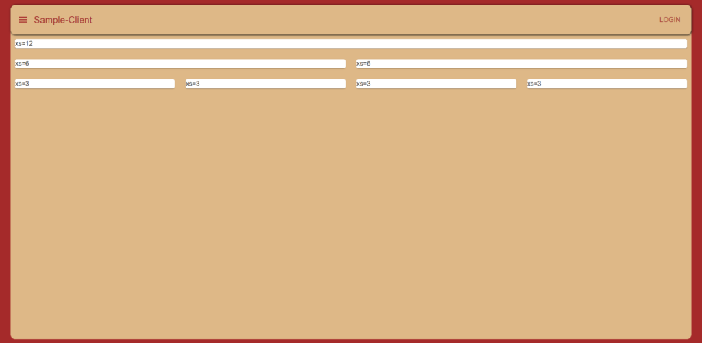
ここまでできたら一旦動作確認してみましょう!
こんな感じで、1行目にxs=12、2行目にxs=6が2つ、3行目にはxs=3が4つ並んでいればOKです!
 クマじい
クマじいこれでGridの使い方は大丈夫じゃな。
PaperをCardに変更する
必要ない方は飛ばしてしまっても問題ありません。
CardはPaperを拡張したコンポーネントです。
リスト程度ならPaperでいいのですが、本アプリケーションでは今後画像なども表示していきたいと思っていますので、PaperからCardに変更します。
Cardコンポーネントをインポート。
Paperは使わないのでインポートを削除して、代わりにCardをインポートしてあげましょう。
- 「import Paper from “@material-ui/core/Paper”;」を削除
- 「import Card from “@material-ui/core/Card”;」を追加
import React from "react";
// react-router-dom
import { RouteComponentProps } from "react-router-dom";
import { Link } from "react-router-dom";
import { Path } from "../../../Routes";
// material-ui
import Card from "@material-ui/core/Card";
import Grid from "@material-ui/core/Grid";
// styles
import styles from "./Sample1Page.module.scss";

type PropsTypes = RouteComponentProps;

const Sample1Page = ({ history }: PropsTypes): JSX.Element => {
  return (
    <div className={styles.root}>
      <Grid container spacing={3}>
        <Grid item xs={12}>
          <Paper className={styles.paper}>xs=12</Paper>
        </Grid>
        <Grid item xs={6}>
          <Paper className={styles.paper}>xs=6</Paper>
        </Grid>
        <Grid item xs={6}>
          <Paper className={styles.paper}>xs=6</Paper>
        </Grid>
        <Grid item xs={3}>
          <Paper className={styles.paper}>xs=3</Paper>
        </Grid>
        <Grid item xs={3}>
          <Paper className={styles.paper}>xs=3</Paper>
        </Grid>
        <Grid item xs={3}>
          <Paper className={styles.paper}>xs=3</Paper>
        </Grid>
        <Grid item xs={3}>
          <Paper className={styles.paper}>xs=3</Paper>
        </Grid>
      </Grid>
    </div>
  );
};

export default Sample1Page;
PaperをCardに書き換える。
Paperを使っている箇所をCardに書き換えます。
styleもcardに書き換えておきましょう。
- <Paper>を<Card>に修正
- className={styles.paper}をclassName={styles.card}に修正
import React from "react";
// react-router-dom
import { RouteComponentProps } from "react-router-dom";
import { Link } from "react-router-dom";
import { Path } from "../../../Routes";
// material-ui
import Card from "@material-ui/core/Card";
import Grid from "@material-ui/core/Grid";
// styles
import styles from "./Sample1Page.module.scss";

type PropsTypes = RouteComponentProps;

const Sample1Page = ({ history }: PropsTypes): JSX.Element => {
  return (
    <div className={styles.root}>
      <Grid container spacing={3}>
        <Grid item xs={12}>
          <Card className={styles.card}>xs=12</Card>
        </Grid>
        <Grid item xs={6}>
          <Card className={styles.card}>xs=6</Card>
        </Grid>
        <Grid item xs={6}>
          <Card className={styles.card}>xs=6</Card>
        </Grid>
        <Grid item xs={3}>
          <Card className={styles.card}>xs=3</Card>
        </Grid>
        <Grid item xs={3}>
          <Card className={styles.card}>xs=3</Card>
        </Grid>
        <Grid item xs={3}>
          <Card className={styles.card}>xs=3</Card>
        </Grid>
        <Grid item xs={3}>
          <Card className={styles.card}>xs=3</Card>
        </Grid>
      </Grid>
    </div>
  );
};

export default Sample1Page;
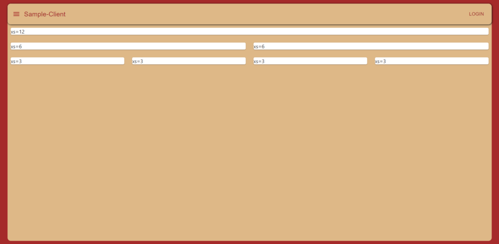
動作確認してみよう!
これで終わりなので、最後に動作確認しておきましょう!
見た目で違いはわからないですね。
本当は、Cardの使い方も説明しようと思ったのですが、長くなりそうなので次の記事で使い方を説明します。
一旦、Cardコンポーネントでも同じ画面が表示できていれば問題ないでしょう!
 クマじい
クマじいこれでわしもGridが使えるの!!
まとめ
今回は、Material UIのGridとCardを使ってレイアウトの調整をやっていきました。
次回は、Cardコンポーネントの使い方をやっていますので興味がある方はぜひ参考にしてみてください。
本記事はReact・TypeScript・Redux Toolkitの利用を前提に実装をしていきます。
構築からデプロイまでやっていきますので、必要に応じて他の記事も参考にしてみてください。
また、今回のReactを勉強するにあたり利用した教材をあげています。
主に本(Amazon Unlimitedを含む)とUdemyの動画教材を利用しています。ここには私なりに理解した内容をもとに独自に内容を考えて共有しているので興味ある方は、本やUdemyを購入して勉強してみることをおすすめします。
学習に使った本はこちら!
クマじいAmazon Kindle Unlimited でもReactの本はいっぱいあるぞ!

